 Web Performance für den mobilen Endanwender
by Andreas Lorer
Web Performance für den mobilen Endanwender
by Andreas Lorer
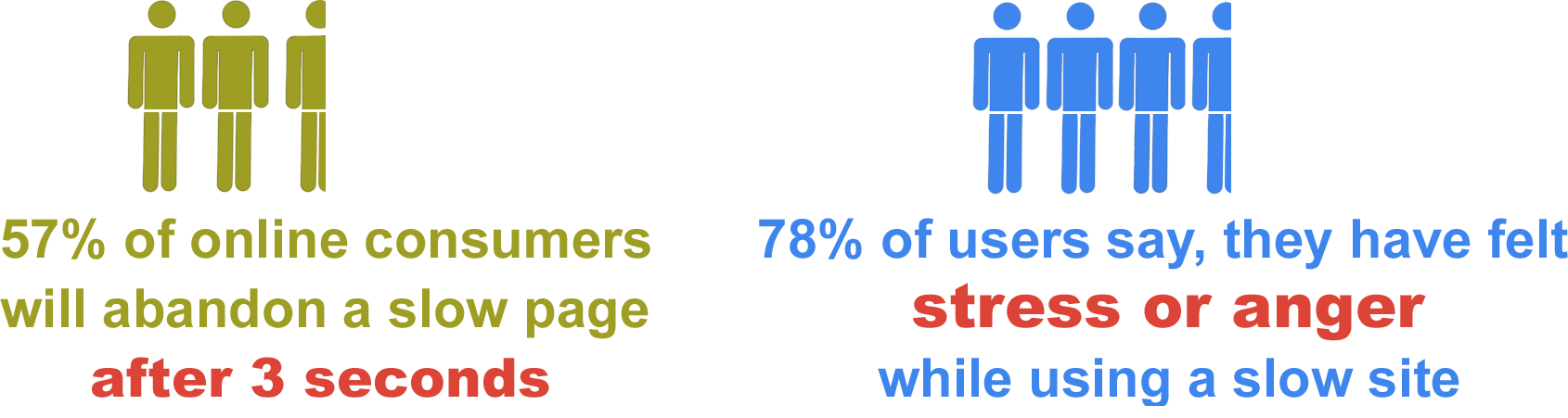

„Elements above the fold were seen more than elements below the fold: the 100 pixels just above the fold were viewed 102% more than the 100 pixels just below the fold.” — Amy Schade 2015
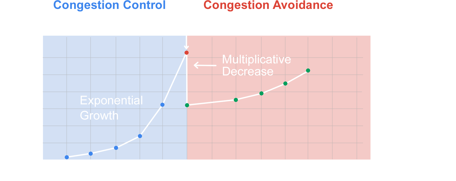
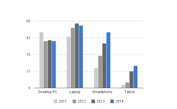
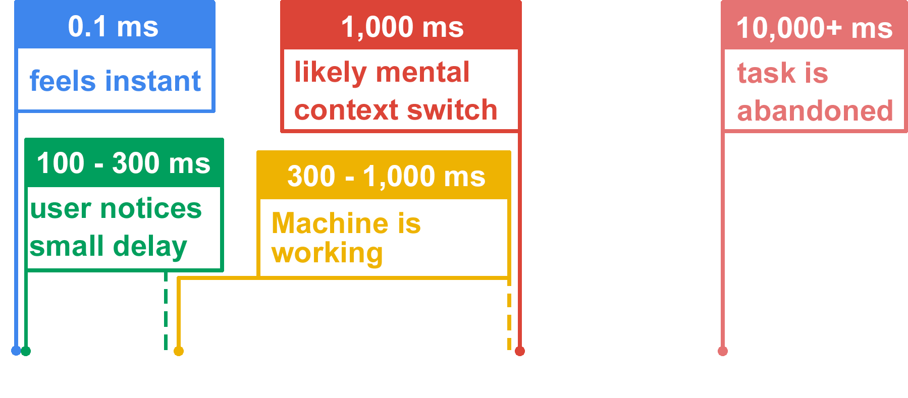
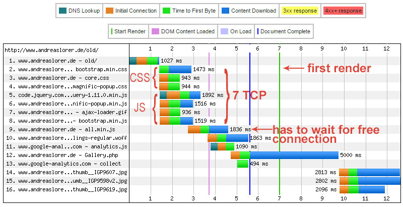
Fetching a 40 Kilobyte file
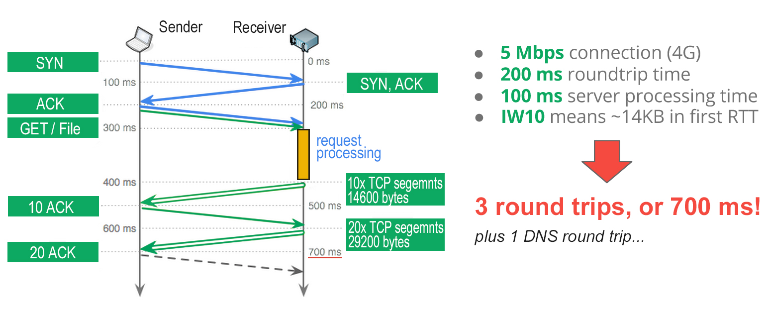
Theoretical approach:
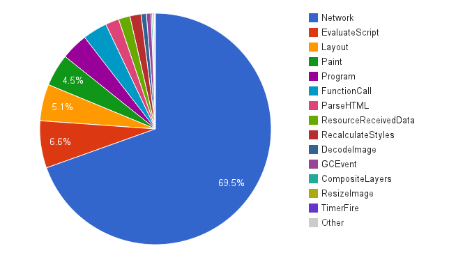
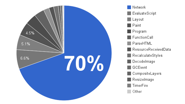
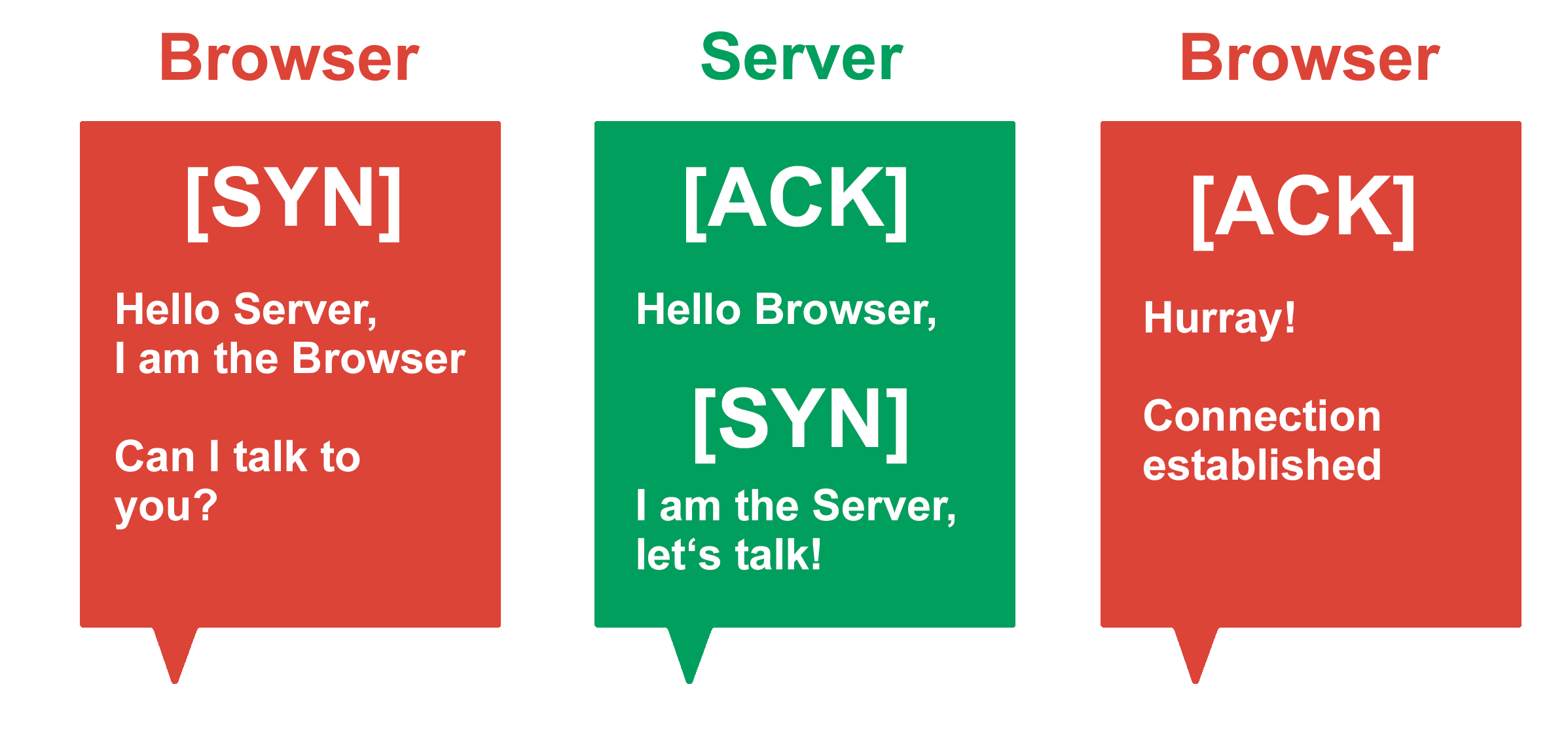
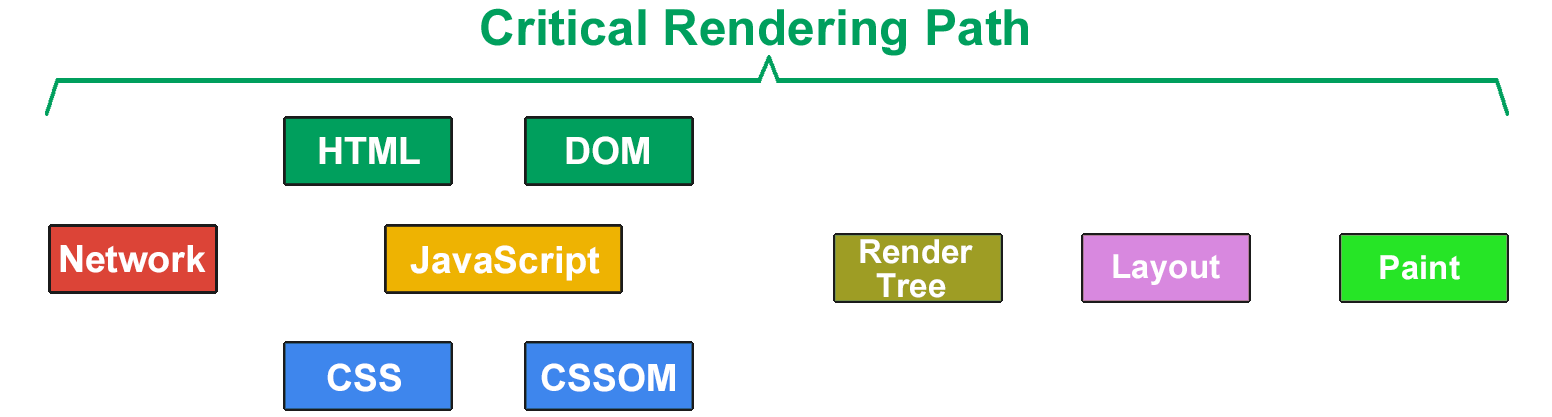
HTTP Components
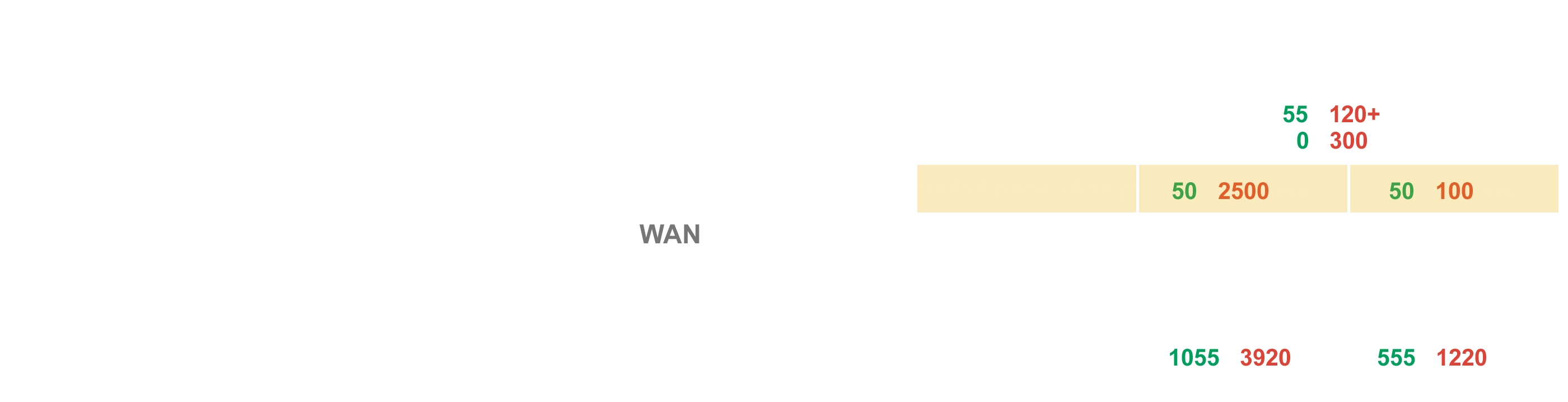
The browser rendering process:

<!DOCTYPE html>
< charset="utf-8">
<>Web Performance for mobile users</>
< href="assets/styles.css" rel="stylesheet" />
< src="assets/script.js"></>
<> Hello world! </>

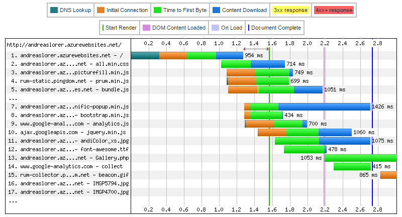
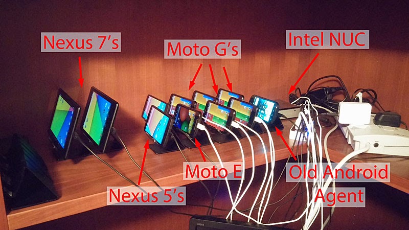
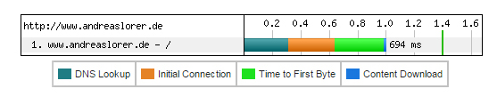
Uses real devices: